1915

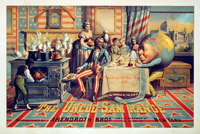
1876
The first image appears to be propaganda for the first world war and the second an advert for a line of american cookers. Both have strong patriotic imagery and strike me as a little unnerving when considered in context.
These two images are similar in style as they're both appear idealistic with very detailed realism captured in paint. I find the Uncle Sam image to be much more gaudy perhaps due to the garish colours and cluttered layout. With regards to layout I think the first poster is much more successful as the focal point is clear and the elements of the image are distributed evenly on the page. It also makes use of a consistent and subtle colour scheme. The second however is confusing to the point that I had to research the poster to work out what it was actually advertising. There seems to be several or no focal points as all elements of the image are equally emphasised and I would guess theres been little thought put into where the different parts of the image should be placed on the page. The colours are clearly chosen to make the image as American as possible to instil a feeling of patriotism in people but I find them far too brash to be visually effective. I think the difference of time between the two is the main factor in the difference between their appearances. 1876 being not long after the end of the American Civil War could explain the overt American-ness of this poster as they were perhaps trying to rebuild a sense of patriotism and pride after war. The other image being published during the first world war explains a great deal about its imagery, such as the bleak colours and the subtle allusions to traditional british style and culture. Everything about the second image seems designed to denote America's power and prosperity
I'm unsure what meaning to read into the first poster. At first I assumed the mans stare indicated recollection of his harrowing tales from the war, such that his inquisitive children could never understand, however that message wouldn't fit with the year of its release and its agenda of recruiting. Therefor I think his stare indicates either his shame at not partaking in the war, with the poster intending to will people into fighting so as not to seem cowardly and dull, or a judgemental stare, from a veteran, intending to guilt-trip men into fighting. Either way it is exploiting the feeling of patriotism to coerce the audience into taking some kind of action, which I think is the same intention as the second poster, except this is suggesting they buy a cooker rather than fight in a war. I find the clash between the holesome and idealistic imagery and the very sinister and political undertones to be quite disconcerting, especially seeing the two images now, long after the time they were created for. In the second image the depiction of what I interpret to be a slave is a striking contrast in norms between then and today. Also the picture of the globe showing only Europe, Asia and Africa reads as a suggestion of their inferiority, perhaps mocking them, or bragging the charity America has bestowed upon them, suggested by the captioning phrase "feeding the world by the aid of..". When seeing it now, after the war, the first image shows a sinister contrast of an ideal family life, children playing with soldiers and chatting about the great war, with the actual horrors of war that we're now aware of, which are of course left unmentioned.
The images make it very clear they're aimed only at people of the country in which they were used. The first is aimed directly at all men in a fit state to fight in the war, as its them who the propaganda is aiming to recruit. The second image is less clear but the most powerful figure in the image is the rather affluent looking man, with the woman and children taking a receding position in the background. Perhaps this is because at this time adverts would be targeted towards the men who earned the money.
I think these images are quite similar, considering their style, hidden connotations, abuse of patriotism and contrast from todays advertisements.


