Semiotics is the study of signs and symbols and their universally accepted cultural
significance. It works on the principle that everything is a sign which signifies something; a
sign is a combination of the signifier and the signified. This theory was proposed by French linguist Ferdinand de Saussure, widely considered the father of semiotics. He mostly used semiotics to analyse language but it has since developed to be relatable to all forms, including the visual language of images. In language the signifier is a word or letter form and the signified is the word it represents. For example, cat; the signifier in this instance is the typed for of that word, the signified is the mental image and idea of what we recognise to be a cat. Within an image the signifier would be the image itself and the signified would be the associations and assumptions it conjures. For example the logo for the Campaign for Nuclear Disarmament, or the peace sign, the signifier is the logo itself and the signified is the concept of peace.
The signified is a connotation assigned to the signifier as a result of a publicly shared historical event or widely understood idea, so the idea of semiotics can be simplified down to connotations and denotations. A denotation is what is actually there, the concrete indisputable thing that is presented, the connotation is the hidden meaning attached to it, based on implication and agreed understanding. When discussing visual semiotics the denotation is the image seen, or its contents, and the connotation is the thoughts and associations provoked by it. The link between the two is based purely on cultural understanding rather than indisputable fact and therefor the connotations of a sign can vary between cultures and individuals. As Berger wrote “The relation that exists between the signifier and the signified is arbitrary, based on convention, or, to use the technical term, unmotivated. Because of this fact, we develop and use codes to help us learn what some signs mean.” This means that the signified depends on what we’ve been taught, and in turn the use of them helps us to learn to understand new codes. It also means that codes can change over time as the general opinion of people shifts, for example in Medieval times being overweight and pale suggested wealth and importance as they had plenty to eat and weren't required to work outside in the sun, whereas being slender and tanned was associated with peasants as they were malnourished and had to engage in strenuous manual labour outdoors to earn money . Nowadays it is quite the opposite, with weight connoting greed and slenderness and tanned skin connoting health and, to an extent, vanity, a hobby of the rich. The signified changes when social norms change. This change was a swapped meaning but changes can also be pejorative or ameliorative; a negative or positive shift. An example of a pejorative change in linguistics would be the usage of the word ‘gay’, which initially meant carefree and cheerful and became synonymous with homosexual, but more recently as a result of ignorance it became an offensive term and can be synonymous with many negative ideas like stupidity and patheticness. The connotations of codes appear constantly flexible but Roland Barthes claims in Mythologies that the assigning of meaning is not arbitrary. We may not be aware of the reason behind the meaning but mythologies all are conceived and changed to form ideas of society that are in keeping with the ideology of the ruling classes and the media of that time. This can explain the earlier example of the connotations of weight as the most attractive appearance was always the trend set by the wealthy.
It’s upon these universally accepted assumptions that stereotypes are built as by their definition stereotypes are ‘a widely held but fixed and oversimplified image or idea of a particular type of person or thing,’ and it could be argued that the basis for cartoons and character design is in these stereotypes. They use both stereotypes that exist in life and ones that have been created throughout cartoon history and have become accepted as expectations. They are useful in this way because it allows characters to become immediately established in the viewers minds because they have a familiar basis to link it to. They give the audience a set of expectations which when met or comically flouted result in instant and universal humour. Possibly the most efficient way to visually present a stereotyped character is in cartoon as it is an art form so open to exaggeration. In an essay on the Semiotics of Character Design in game development Christopher Sean Lee
wrote that stereotypes are a “way of concisely conveying information through imagery within the design of a character”. He describes signifiers as “incredibly useful efficiency tools that can easily speed up human cognition and understanding” and states that using signifiers in character design can “harness the innate energy and time saving capabilities of stereotypes... the use of stereotypes would immediately ground the character within the story and visually cement their role within the game” This can apply to cartoons also because manipulating this human understanding in the same way has the same effect, planting the character into the story and eliminating the need for description. It could even be argued that this is an important quality for all good characters and designers to possess, the skill to make the characters appearance reflect their personality so accurately that they never require explanation. An example of this would be any character in a classic disney cartoon. There is a visual code for each potential personality of which we are not immediately conscious. A villain would typically be ugly, elderly, angular, with prominent bones, bad posture and in dark costume, often draping fabric and cloaks. (see Source 1) The lead male usually is of a toned and muscular build with traditionally handsome features and loosely styled hair. (see Source 2) Female leads mostly look youthful and innocent, exhibiting traditional beauty, often accompanied by a small animal sidekick and are frequently princesses. (See Source 3) Since many of these stories are based on fairy tales it’s likely much of the inspiration for the characters’ design was derived from their descriptions in the original text, although many are said to differ dramatically, such as The Little Mermaid. Regardless of their origin these codes have been perpetuated by Disney to the point that they’ve become the expectation and have actually effected ideas within society by creating unrealistic standards for beauty, love and the accomplishment of dreams. As a result of these codes we have been taught to incorrectly perceive humans in the same way; old and ugly is in some way villainous, young, pretty and virginal are the desirable traits in a female and the measure of a male character is in his braun and bravery.
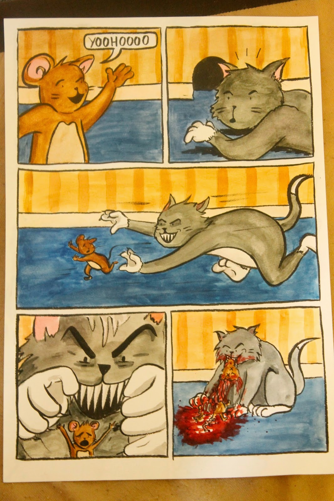
This basis of assumed knowledge is prevalent in other children's cartoons also, for example the common trope of predator and elusive prey seen in cartoons such as Tom and Jerry, Coyote and Roadrunner in Loony Tunes and Bugs Bunny (with Elma Fudd). The characters are consciously designed to be enemies in nature thus eliminating the need to explain the relationship between them. It is assumed that a cat will chase a mouse because we have been taught that code in nature, so it would make sense to exploit that code for relatable comedic value. This assumption of nature is then comedically flouted in these cartoons when the predator fails to capture the prey and is repeatedly outwitted by it in a classic battle of brains and braun, thus they have achieved a comedic effect by using semiotics.
This example can be seen in other cartoons where the basic assumed plot is whatever is signified by the characters, which act in this case as signifiers. When seeing a family such as The Flintstones one can instantly identify that the plot will revolve around dysfunctional American family life with the quirk of a foreign timezone added for entertainment value. When shown a picture of Pinky and the Brain one can assume the plot lines will revolve around a serious character and their idiotic sidekick, wherein the genius’ plots are constantly ruined by his foolish friends actions. Also to return to the topic of Disney animations one can always assume when seeing an attractive youthful cartoon man and woman that unfolding in the plot will be a pattern of love-at-first-sight, some description of obstacle between them, triumphing over adversity (usually the male’s role), ‘true love’s first kiss’ then happily-ever-after. These are the codes we have been taught to expect by cartoons which they either deliver on or flout, but of which they are always mindful of in order to make the cartoon familiar and likeable.
In almost all cartoons, particularly comedic ones, there is a blatant disregard for the consequences of violence and injury. They abuse the fact that it is impossible to injure their actors and so tend to neglect realism and replace it with ‘Cartoon Physics’. This was a concept first proposed in 1980 by Mark O’Donnell (link in bibliography) in his article ‘The Laws of Cartoon Motion’, which states accepted assumptions about logic in cartoons which are codes cartoons have taught us to expect. Most of these relate to Looney Tunes and other such classic short children's cartoons and point out cartoon traits that we just accept when watching because we have been trained to do so. In reference to my earlier point about cartoons’ tendency to neglect the consequences of characters violent actions, one of these Laws of Motion is that “Cartoon cats possess more deaths than even the traditional nine lives afford. They can be sliced, splayed, accordion-pleated, spindled or disassembled, but they cannot be destroyed. After a few moments of blinking self-pity, they re-inflate, elongate, snap back or solidify.” This has probably been a conscious decision on the part of cartoon creators to try and create a world free from the constraints of human capabilities and mortality, but as a result of this shrouding it is now particularly shocking to see violent consequences in self referential ‘adult’ cartoons like Family Guy and South Park. They address this trope by playing to it and frequently killing and injuring characters only for there to be no lasting consequence. The most obvious example of this is the character Kenny McCormick who prior to season 6 of the show died in almost every episode, to the cry of “Oh my god! They killed Kenny! ...You bastards!” or variations thereof. This mocking of a trope became a trop itself over time to the point where Kenny was expected to die and the only place to advance from there was to flout the show’s own created expectation and let him survive, or enter an incredibly complex subplot involving soul consumption. This means that the death of Kenny became signified from the signifier which is the show South Park. There exists similar running jokes in Family Guy where characters are shown to be violently mutilated and even killed, only to appear in a later scene. This is done in a self aware manor meaning it stops being an assumed norm of cartoons and starts being a comedic idea that flouts stereotypes, but once again this became expected of the show, leaving the only way to flout expectations to be actually killing a character permanently, which was Loretta Brown in the Family Guy spin-off The Cleveland Show. The death of this character reflected this argument quite perfectly because they chose to negate a code of assumption that the show itself had created; a running gag where Cleveland Brown’s house is repeatedly destroyed and he falls from the upstairs bathroom in the bathtub, lands on the ground where it smashes and invariably escapes unscathed. In this particular scene Cleveland is replaced with his wife Loretta so as the joke is set up the viewer expects the same outcome as usual, the one the show taught, but instead she breaks her neck and is permanently killed. This technique exhibits a clever manipulation of semiotics and an awareness of the consistent traits of ones own creation. Of course this plot line can be linked back to the Simpsons, perhaps the cartoon show most known for its use and negation of semiotic codes, in the episode where ‘Alone Again, Natrua-Diddly’, wherein long-running periphery character Maude Flanders is killed in a freak slap stick accident. Where in a more traditional cartoon the accident of Maude being knocked off a grandstand by a t-shirt cannon would have been a humorous instance of slapstick comedy, in The Simpsons it was an distressing and poignant plot line and character development for Ned Flanders, with characters experiencing genuine human grief at the realistic loss of a friend and a sympathetic character. As well as this The Simpsons commented on the idea of consequence-less cartoon violence in an often used code wherein the characters themselves explore a self referential problem. In the episode ‘Itchy & Scratchy & Marge’ Marge is outraged at the violence in children’s cartoons and begins a protest leading to the eventual cancellation of the show. It’s possible this was a tactical effort on the show’s part to counter-attack complaints about violence in the show and people asking for an end to it, by showing them the potential outcomes of their wish and how it would be no better at all.
It can be agreed that most cartoons work on a basis of assumed knowledge in order to communicate stories and jokes as quickly and efficiently as possible, which is necessary for such a time consuming medium. It could be argued that all cartoons are signifiers with each genre and visual style connected to its own set of codes. What is signified is the assumptions we associate with the given type of cartoon.
A cartoon that makes full use and abuse of all of these rules and theories is Drawn Together. It is an adult cartoon show which on the surface appears crude and unsophisticated, much like South Park, but upon closer watching one realises it satirises both reality television and all genres notable genres of cartoons with its basic premise, not to mention it’s constant cynical referencing of all aspects of American culture. Essentially it is a show built on widely under references and the comedic mocking of these traditional cartoon codes. In an essay entitled Drawn Together: A Rhetorical Analysis “For Real Real Not For Play Play a blogger wrote “The purpose of Drawn Together is simply to re frame a number of popular animated texts by basing their own characters on preexisting characters from those other rhetorical texts... By grouping references from all these disparate texts together, they can be juxtaposed and the fallacies of each of the original texts emerges.” As in the previously mentioned point of stereotypes in cartoon characters eliminating the need for explanation, Drawn Together uses and defies the expected conventions of the types of characters being parodied, so this too is an understanding of semiotics and cultural codes being put to use.
Perhaps the cartoon using these various analytical devices to its greatest advantage is The Simpsons. Almost every aspect and occurrence in the show is derived from some description of cultural code or semiotic subtext. It could be argued that almost all members of the main and extended cast of The Simpsons are based on a known stereotype or media trope. In many cases characters owe their success to the use of such codes. The Simpsons uses stereotypes to it’s advantage to create the basis for a familiar, relatable and ridiculous character. Almost all the characters can be reduced to a short descriptive phrase that captures their personality and design: Krusty; a tragic clown, Ned Flanders; devout traditional christian, Marge; repressed yet efficient housewife, Nelson; bully who craves attention, etc, meaning these character traits are making full use of semiotics, especially since they are recognisable just from their appearances.
Arguably the most important aspect of the Simpsons character design is their iconic yellow
skin. There are several reasons floating around as to why that decision was made all of which can be found in the bibliography (see source 4) but whatever the correct reason it’s still evident that it was an informed decision, perhaps intended to defy the assumption that traditional and relatable cartoon humans must be rendered representationally; the creators saw this trend and broke it to make their show iconic and recognisable. The character design can be seen as representative of the structure of the entire show, a mixture of meeting and flouting semiotic assumptions for familiarity and comedic effect. There are endless examples of how and when this is done throughout the 25 years of episodes and to list and analyse each one would be substance enough for a much more sustained piece of writing than this, but there are a few examples one can briefly pick up on. Firstly the actual content of episodes. Such a large proportion of the plot lines are either loose parodies or new and less glamorous attempts at existing stories, meaning a full understanding of many of these episodes requires a rather solid knowledge of American culture and of the codes and social norms found within it. Within this there’s the almost constant references to other works in the titles of episodes; The Old Man and the C Student, Das Bus, Simpson and Delilah and Simpsoncalifragilisticexpiala(annoyed grunt)cious to name a few. These are all yet another set of jokes that only work upon the basis of a shared understanding of a culture, and the familiarity of a certain pattern of words pertaining to a widely accessed pre-existing work. Also, even though it isn’t always the case, one assumes that the title of the episode relates to the plot in some way, so for example the title of You Only Move Twice signifies the idea and themes of James Bond because of the titles’ structural similarity, therefor one assumes the plot and jokes will be similar and in some way referential to the Bond franchise, meaning that cultural assumptions have been used to express clarity and humour.
There are of course many more examples of the use of semiotics in cartoons but at it’s most basic level, as represented here, it is perhaps undeniable that the foundations of animation and illustration with the intent to communicate efficiently can be found in the solid understanding and manipulation of cultural codes. Without their use the medium would be so far removed from life that it would become perturbingly unfamiliar and all the charm cartoons possess would be lost.
Barthes, R. (1957) Mythologies. France: Les Lettres Nouvelles
Balley, C & Sechehaye, A (1983) Course in General Linguistics, Illinois, Open Court(Roy Harris English translation)
Blogger user under the name ‘sassbot’, (2011) Drawn Together: A Rhetorical Analysis “For Real Real Not For Play Play
Cobley, P & Jansz, L. (2004), Introducing Semiotics: A Graphic Guide, New Edition, Icon Books Ltd
Danesi, M. (2002) Understanding Media Semiotics, Bloomsbury Academic
Chandler, D (2007) Semiotics: The Basics, Routeledge
Sources -
Source 1
Source 2
Source 3
Source 4
There are several reasons floating around as to why that decision was made. It is
stated by an animator on a section of the DVD commentary footage that originally the
show was made using traditional cell paint which at the time was only available in eighteen
colours, and yellow, being the closest to flesh tones was selected. A more common
explanation is that the animators wanted the show to be instantly recognisable by the
viewer as they flip through the channels. Yellow means Simpsons. This strategy, if true,
has definitely been proven to work as now the yellow skin tone is the biggest factor used to
distinguish between this prime time cartoon show and many others. Third is from Director
David Silverman who stated that the Simpson children do not have a defined hairline and
adding one would have spoiled the integrity of the design, so yellow was selected, being
the only colour plausible for both skin and hair.
It is worth noting the visual differentiation between yellow and non yellow characters.
Some say that the yellow skin tone makes the characters devoid of race but when seen in
comparison to characters with brown or paler skin tones it becomes more logical that
yellow represent caucasian. In more recent series’ the spectrum of skin tones has
expanded to include all ethnicities and members of the recurring cast have skin tones
ranging from dark brown for African American characters life Carl and Doctor Hibbert, to a
lighter brown for Indian characters Apu and Manjula and often an inconsistent pale skin
tone used for chinese characters but also to represent the silkiness of school child Wendel
and Krusty The Clown (who is not wearing make up).