I chose to use watercolour because its a medium I can use quickly and easily to acheive the desired effect. Also it makes consistent yetsubtley different colour palettes as everything is mixed from the same few colours. Regarding colour palettes I chose to emulate the aesthetic of the specific cartoons as they form part of the assumed content of each show.
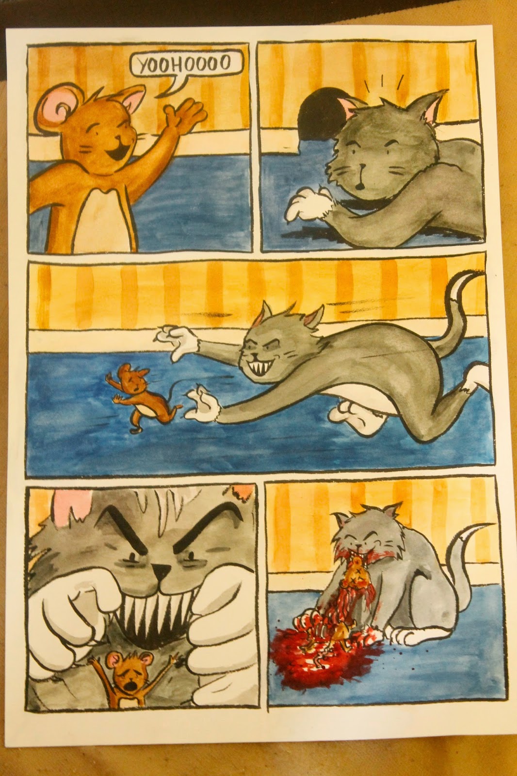
The middle panel on this image appears too static to show a violent chase but I struggled to find out how to combat this, motion lines didnt seem to work. Drawing movement and momentum is something I need to practise.

I think this show has the best colour palette to copy because it makes use of contrasting shades on the colour wheel, using an accent of blue on roadrunner against the diluted orange and brown of the desert.
I think the composition of the fourth panel is a bit clumsy, specifically the placement of roadrunner, it looks too stationary and force to fit onto the same panel.

I ended up cutting out the teeth grinding panel because it didn't make sense. I also slightly altered some panels, adding the doorframe on the second one and Homer's head on the last. I changed the viewpoint of the fourth to get a better and more Simpson-esque view of the kitchen. The third panel I tried to emulate 'spongebob realism', a technique used in spongebob where close ups on slick cartoon designs are grotesquely detailed paintings. I had a fair amount of difficulty painting the fire, mostly because I didn't have time to practise it beforehand, in the fourth panel a black line overlaps it and generally it looks flat and underwhelming.

I think for the time I ended up spending on them I'm quite happy with these drawings, but for the amount of time I intended to spend on them they are quite ashamedly bad.
No comments:
Post a Comment